Today I received an email regarding a change to the Play store, about how app icons are increasing in corner radius from 20% to 30%. How much more round do you need your UI to be, Google?
I am not just going to complain about corners. I want to talk about Google's modern Material design, and how it has been an antithesis of user choice, and how that's in line with Google's recent sentiment towards Android.
(This post represents my (Andy Herbert's) own opinion based on personal experience, where I seek to back up claims with details and images. I do not use generative AI, including in this post. UI design is an ongoing debate, so claims I make about UI/UX and preference can be argued against and for, with further opinions and research.)


The original material design debuted around 12 years ago, paving the way away from the 2000s-2010s UI design of physical materials (like Windows 7 or old iOS/MacOS, where UI assets had shading and transparency and other neat details, known as skeuomorphism) and towards the 2015-2025 trend of "simplicity" in the form of singular colors (known as flat design, and variants as neumorphism or corporate memphis).
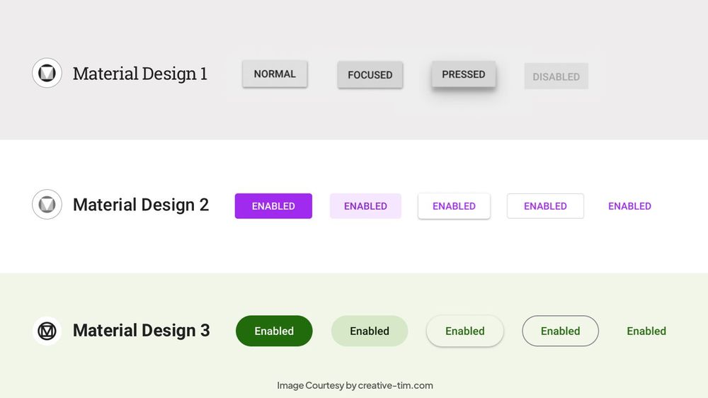
Material V1 aligned with Windows 8 and iOS/MacOS UI redesigns with similar themes- simplicity, singular colors. There were also differences, which you can compare for yourself in the below image.

What was the reaction to this? If I recall, at least for Windows 8 people called it dumbed down and unintuitive, though that involved a dramatic shift with the OS, not just the UI. Over time the new styling became accepted, and with Windows 10 undoing the controversial changes from windows 8, things were fine.
Regarding Android, Material simply sat on top of the prior UI framework, without too many major changes until 2018, Android 9. There were some changes though, notably an experimental quick settings customization allowing coloring the quick settings icons, introduced in Android 8 if I recall, as well as eventually a re-introduction of a dark theme (or re-removal, dark theme has been on and off in Material). Of course with Android being "open source", custom ROMs introduced additional customization features beyond what stock Android had (providing at least one reason not to use stock Android). Android 9 comes around, and with it Material 2, introducing the plague of rounded corners... But the storm wouldn't arrive until Material 3.
Material 3, also known as Material You, is the best idea of user controlled, customizable UI, which Google has implemented and botched up in the worst way possible. Introduced in Android 12, the idea is that the UI would change based on user preference, or their wallpaper.
But what did that actually mean? In stock Android, a bunch of bland, faded colors generated by what's known as the monet engine. I run a rooted phone, and a big reason why I maintain the importance of keeping root, is because stock Android chokes the customization of UI colors with Material "You". I have made my phone's UI colors tuned to bright and expressive colors which I want, which are impossible to generate in stock Android. Oh, and the stock Android "dark" theme is more of a grey background rather than true black.
But that's not all! Remember the quick settings thing that was experimental some Android versions back? Well with Material 3, the quick settings drawer was redone to its worst iteration to date. Stock Android would show a 2x3 grid of buttons, filled with a little bit of text and tons of blank space, as if I don't have a giant phone and need extra space to tap on stuff. Features like the quick menu to change wifi or connect to bluetooth were removed or changed, requiring once again root access and 3rd party apps to restore functionality, and better utilize the space of the quick settings menu. My phone, a tall Xperia 1 V, can comfortably fit 3x5 quick settings in portrait mode, but only with the help of some root apps.
And now we get to corners. Why??? I have no clue, but Google decided circular buttons would be better than rectangular ones. Everywhere on their devices, their interfaces, rounded corners, lines with rounded edges, everything made to look soft. But what's the real issue with that? Space wasted. The buttons have never been so massive, the UI widgets have never taken so much space, because of these rounded corners, even app icons are being forced to show rounded corners!
Because the edges of containers are round, there is less usable space within the container for relevant information like text or an image, while the area around the edge would have to remain empty so as to not appear misaligned or clipped due to the rounded corners. Arguably this results in too much whitespace in an interface, requiring unnecessary interaction to scroll the interface to view information (some whitespace is good for readability but too much hides readable information). Rounded containers don't align nicely in a grid or horizontal/vertical layout- the space between the rounded corners would stick out and remain wasted. Most electronic screens don't have rounded corners, they have 90 degree corners, so thanks to the rounded corners of Material 3, there's a few pixels just being kept blank on modern phones and computers. Also, generating rounded corners isn't exactly free computationally, so because of this forced UI requirement, devices will have to spend a little more GPU power to round borders and make more whitespace.
It is obnoxious. Who asked for this? What purpose does it serve, other than to confuse and make the UI less intuitive to use? Why this??? Why do I need three different root-enabled apps just to get the customization that should be in stock Android on my phone?
I have gone as far as to force border-radius: 0 on my web browsers, to alleviate most of the rounded corners that appear all over the web, and arguably, the web remains very usable and much nicer to look at. I am not staring constantly at pointlessly round buttons and borders, at the expense of loading icons glitching out because apparently they're made with CSS border-radius. Despite this, Google still manages to shove rounded corners in their interface! On my phone, one of the root customization apps allows changing the border radius on system UI, which worked before I updated to Android 15 recently.
I want to go back to an image I had up above:
What's one thing which stands out between the three interfaces, circa 2014? For similarities, all three interfaces feature bright, vibrant, and clear colors, with well proportioned icons, all good for readability and usability. For differences, for iOS, the icons have subtle gradients. On Windows, they lack gradients, but have uniformity in single colors plus white icons in a square box. For android, the icons are unique in shape and color- transparency!!!
Material 2 undid perhaps the most unique component of Android's UI, that being the icon transparency. And with Material 3, the uniqueness of the UI is being stripped away even more, as Google is forcing apps to conform to stricter requirements for app icons. Introducing, adaptive icons:
Sorry, wrong image, but related. Here's actual adaptive icons:
At least this is a setting which can be toggled.
Here's a usability test you can perform right now: Look at the three images above at a distance. How close do you have to be to the device, where you can recognize which app is which, based on its icon (how big do the icons have to appear in your vision)? I would guess, with the first image of Material 1 and its unique, transparent icons, it's probably the furthest distance, while the other two images would have to be closer, but depending on how well you perceive color and outlines, either of the second or third may stand out after the first.
What does this mean? Adaptive icons, and Google's recent icon redesign towards blue-red-yellow-green, harm readability, completely couterintuitive to the intentions of Material 3.
What this comes down to: These changes are making it more irritating and more difficult to use Android, and Google's services as a whole. They sacrifice customization and user control in stock Android in exchange for pointless and harmful UI changes. Fixing these changes presently require extreme modifications such as root access or extensions to alter website CSS, all to provide relatively simple settings which have no excuse not to be integrated into the stock OS.
It aligns with modern Android as an "open source" OS- Google has been hiding more and more of the backbone code which makes Android. They have been limiting the source release more, and they have been making it clear that they control which changes get implemented into the core of Android, as their own interests rather than the interests of the users and developers of the most used mobile operating system in the world. In the spirit of Google googlifying Android and enforcing more control, they have been doing the same with the system UI. Apps on the Play Store can no longer be expressive without being limited to 30% rounded corners and an ugly white background in place of transparency. What's next, will apps no longer be allowed to have colorful app icons? Will they all need to be a minimum size in the shape of a circle?
In my opinion, this is just one of the many aspects which shows that Google can no longer remain in control of Android/AOSP. Google makes changes which do not have any clear benefit to the OS, but which align closely with their own intentions of uniformity and control (control in this case over UI style, but the larger picture being control over user choice, even user thoughts and preferences). Android legally, and for its own survival, needs to be placed under the ownership of a non-profit organization, consisting of members from a variety of companies and backgrounds, who can better represent a non-biased view for the interests of future Android updates.
Imagine if Linux wasn't controlled by community contributors and a non-profit foundation. Imagine if it were instead owned by Apple or Google or Microsoft or some other company, being called open source yet clearly controlled by its parent company. Imagine if the parent company made a new style change to the default desktop environment, forcing all icons to look the same and be the same shape, with no way to change that without 3rd party programs or complex root commands. Imagine if the Linux kernel source code was updated officially twice a year, with changes contrary to community pull requests and discussions, but which conveniently align with the parent company's interests. Imagine if the very thing that makes Linux, Linux- its open source nature- were stripped away by the people choosing which updates go into the source.
That is what is happening to Android. It is being stripped away of its identity, of what made it unique. And that is a threat to millions of people worldwide. There's perhaps a theory with UX, where the user might not know best, so it's up to the designer to show them what they want- yet it should be up to the designer to show the user, give them at least the choice, rather than choosing for them. Not every user can rewrite the Android source code, but that doesn't mean users can't make decisions about icons or UI roundness or system colors (or app store choice, or external app installs, or simply, how they can use and own their device).
But going back to UI, I want to end with requests to Google, to implement into AOSP. I want to make requests which do not conflict or completely override Material 3, but rather provide the option to users to choose whether to enable Material 3 on their device. Also, while many UI aspects can be applied to websites, I want to emphasize changes to Android.
- There are two root enabled open source apps: Iconify, and ColorBlendr. They feature many customization options which I have mentioned above.
- I request that all (but not limited to) options presented in these apps be integrated into stock Android, in settings.
- Settings should be categorized for user convienence, where basic settings like primary color or icon style, should be presented upfront, while more advanced settings like the monet engine editor or quick settings customization, should be presented in an advanced window.
- No setting shall be hidden or removed or locked, including being hidden into developer settings, except in the extreme case of device hardware not supporting a setting (like blurred transparency).
- The stock monet engine shall emphasize the user's preferred primary and secondary colors without further color grading
- If the monet engine would result in less readable color contrast, a warning should be presented to the user to inform them, but not limit them
- Shape and style restrictions on app icons in the Play Store shall be made optional
- The only restrictions required to apply should be for icon size
- App icons shall have the option to support full customized icons with transparency, or rely on Material-based rendering for support for user-controlled themed adaptive icons
- The option to change between Material specifications, and pre-Material styling, shall be an option
- the user ideally shall be able to select to apply the UI theme system-wide or for specific components
- It is not expected that newer UI components have support for older themes, as such the user shall be informed prior to applying changes if there will be any incompatibilities
- A system-wide setting on UI roundness and whitespace shall be introduced
- The system UI shall apply spacing between elements based on these settings, similar to settings for system font size or UI scale, however this setting works independently
- The setting can function similar to CSS styling, where a percentage unit represents a percent of the parent element, for padding or margins.
There is no single perfect UI style, except for that which the user can choose to change to their own preference, and which doesn't get altered without the user consenting to changes. I do not consent to the change to app icons on the play store.
Feel free to comment and discuss this. If you work at Google on Android, I would like to know the answers to some questions:
- Why Material 3? What sort of proof exists which shows Material 3 is good for the user?
- Why haven't more options for user controlled customization in stock Android been implemented for Material "You"?
- What makes Material 3 superior to 2 or 1 or pre-Material, in the perspective of Google?
- Why the need to drastically change and revise UI and icon styles? What proof is there showing that such changes is necessary for the UX?
No comments:
Post a Comment